PPP Watchlist
The PPP Watchlist is the curated list of stocks Pure Power Picks is watching each week — the on‑deck circle. Many alerts start life here, so the page lets you see what's being tracked, why, and how those picks turn into alerts over time.
PPP Watchlist and PPP Alerts are what we publish. My Alerts is your own shortlist of the alerts you starred. The PPP prefix is there so a page never leaves you guessing which of the two you're looking at.
This week's watchlist
The weekly announcement in the Discord lounge can include emoji reactions that match the businesses or themes on that week's list, such as coffee or aerospace. Shared themes get one emoji, and some tickers may not have a match. These are decorations, not rankings or bullish/bearish labels.
Opening PPP Watchlist puts you straight on the newest week — no clicking through a list to get to it.
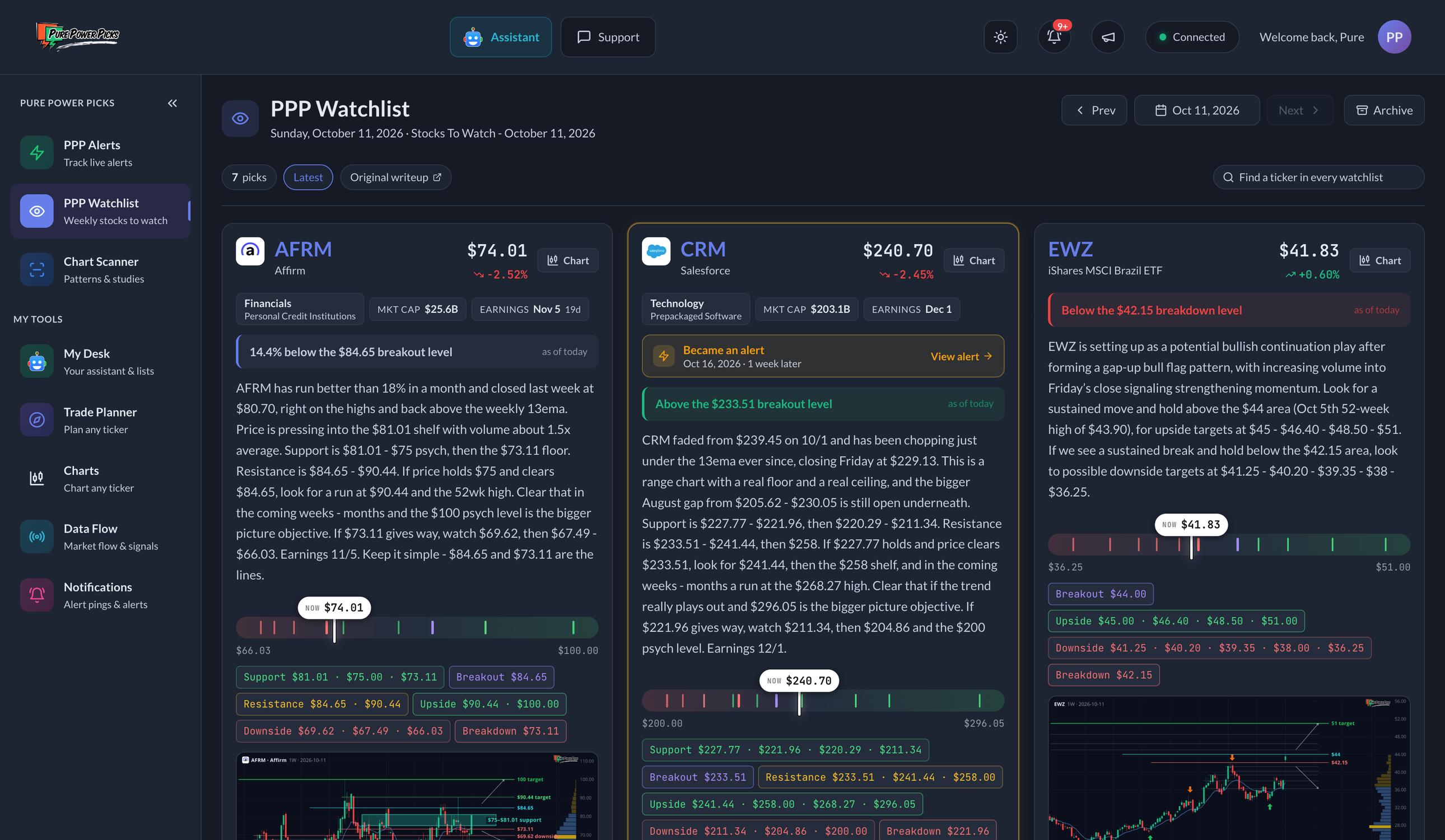
The current week: each pick with its live price, the levels drawn on a rail with a marker for where it's trading now, and the chart from the writeup.
Each stock is a card showing:
- The company logo and name next to the ticker.
- The thesis — why it's being watched.
- Its live price and today's move, refreshed while the page is open.
- Quick stats — the broad sector with the more specific industry underneath it, market cap, and the next scheduled earnings date. Earnings inside two weeks are highlighted, since that usually matters to how a name trades.
- Price levels — support, resistance, upside/downside targets, and the breakout/breakdown triggers — drawn on a rail with a marker for where the stock is trading right now, so you can see at a glance whether it has reached the levels in the writeup.
- A one-line read of where price sits against those levels, like "Above the $114.60 upside target" or "2.1% below the $64.43 breakout level." This always describes today's market against the levels published that week.
- A chart snapshot — click to enlarge. Once it's open you can zoom: pinch or double-tap on a phone, scroll or double-click with a mouse, and drag to move around while zoomed. See What's on the chart below.
- A Chart button in the top corner, which pops the live interactive chart open over the page — change the timeframe, add studies, draw on it, then close it and you're back on the watchlist exactly where you were. Anything you draw is saved to that ticker and is waiting for you on the Charts page too.
- An earnings flag when earnings are close.
- If the pick became an alert, the whole card gets a gold border and a Became an alert bar showing the alert date and how long after the pick it fired — click it to open the alert.
Each week shows its published picks in one list. Repeated Continued Watch cards are no longer shown when that ticker already appeared in an earlier week. Scroll to earlier weeks, or use the date picker or ticker search to return to the original writeup, chart, and levels.
A genuinely new weekly setup for the same ticker still has its own card. If a legacy Continued Watch entry is the only original record of a name, that first appearance stays available in member history. Historical records are not deleted. Stock cards no longer display Bullish, Bearish, or Neutral labels; both sides of the published trade plan remain visible in the levels.
Not every pick has published levels; when none are available, the card shows the thesis and any available chart without a level rail.
What's on the chart
The chart on a card is the writeup, drawn. Weekly candles for a weekly read, daily candles for a daily one, with the 13 EMA in blue and a volume-at-price rail down the right edge showing where the stock has actually traded most.
On top of the candles:
| You'll see | What it means |
|---|---|
| Green shelves above price | Ceilings from the writeup — old highs and supply the stock has to get through |
| Red shelves below price | Floors from the writeup |
| One bright green line with a label | The headline objective the read is built around |
| A cyan line marked breakout level | The price that has to give way for the bull path to start |
| A shaded band marked support | The area the writeup wants to hold |
| A purple dashed line marked invalidation | Where the idea stops being right |
| Thin white arrows | The paths described in the writeup — up to the next objectives, and one the other way |
| Fat green arrows under a candle | That week really did trade down into a level and close back above it |
| Fat orange arrows over a candle | That week really did reach a ceiling and close back below it |
Every line sits at a number the writeup published — nothing is rounded or nudged to look tidier. The green and orange arrows are read off the candles themselves, so they mark tests that actually happened, not predictions.
Charts refresh through the week, so the candles stay current even though the levels are the ones published that week.
Moving between weeks
Use Prev and Next to step through the weeks, or the date button to search all of them. Every week has its own link, so you can bookmark or share one.
Older weeks load automatically as you scroll toward the bottom, one week at a time. Each new section starts with its week/date heading, and the writeups you've already loaded stay in place. The page tells you when you reach the earliest watchlist.
If a week fails to load, use Retry loading to try again without losing the weeks already on screen. Browsers without automatic scroll loading show a Load previous week button instead. Selecting a different date starts a new week-by-week view from that date.
Find a ticker in every watchlist
The search box at the top right of the week, next to Original writeup, looks across every watchlist we've ever published — not just the week on screen. So you don't have to page back week by week to find a name.
- Type a symbol (
AXP) or a company name (american express). Either works. - Each result shows how many weeks that name was watched and when it was last on a list.
- Pick one to open its full ticker history.
- Keyboard: ↑ ↓ to move, Enter to open, Esc to close.
Archive
Archive opens the back catalogue: search across every watchlist by ticker, company name, or thesis text, browse all weekly lists, and see the pipeline and most-watched panels below.
Watchlist → Alert pipeline
This shows the payoff of the watchlist: which weekly picks went on to become alerts. Each row is one alert, showing the ticker, the alert date, and how many weeks passed between the watchlist pick and the alert.
A name is often carried on the watchlist for several weeks before it's alerted. When that happens the row shows the lead time from the first week it was watched, with an 👁 badge for the number of watchlists it appeared on beforehand — so one alert is listed once, not once per week it was watched.
Below the list is a summary like "N alerts started on the watchlist — X of Y watchlist appearances led to an alert within 4 weeks." The two numbers count different things, which is why they differ: the first counts alerts, while an appearance is one stock showing up on one weekly watchlist. A name watched ten weeks running is ten appearances.
Historical Continued Watch mentions still count toward appearances, most-watched totals, and watchlist-to-alert connections. Hiding a repeated card does not erase that history. Weekly card counts show only the cards available to browse.
Most‑watched tickers
A ranked view of the tickers that appear most often across all watchlists, with a bar for frequency and a marker showing how many times each has been alerted. A ticker watched for three weeks before a single alert counts as one alert here. Click any ticker to see its full history.
Ticker history
Click any ticker to open its own page: its original and updated weekly writeups, with their dates, price levels, charts, and alert links. Repeated Continued Watch cards stay hidden, while the totals include every historical appearance. Alerts linked only through a hidden mention remain available as dated links above the cards. It has its own link too, so a single name's history can be shared.
How to use it
- Scout ahead — see what might become an alert before it does.
- Understand the thesis — the watchlist often carries more background than a fast‑moving alert.
- Track conviction — names that appear week after week are ones the team keeps coming back to.
When a watchlist stock becomes an alert, you can jump straight to its live alert detail page from the watchlist entry — the price levels you read about carry through.
The watchlist is research and commentary for educational purposes. It is not a recommendation to buy or sell any security. See the disclaimer.