Reading a plan
A complete plan has two conditional cases. Read their starting conditions and invalidations before interpreting the target ladder. A No clean setup result explains why a complete plan was not supported.
The header
Across the top of an expanded plan: the company's logo, its ticker, its full name, what it actually does, and the window the plan was written for. It's the same block whether you just generated the plan or opened it from your saved list.
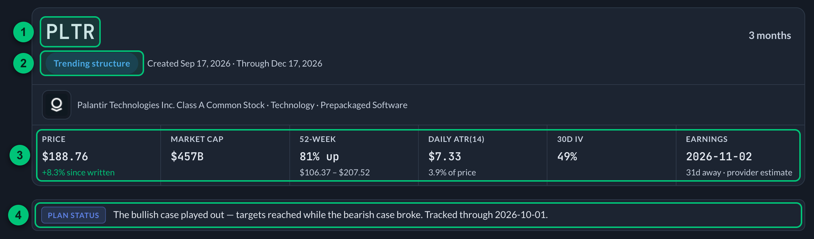
① Header — the ticker, with the company and the window in the same block. ② The read — the neutral structure label. ③ Stat line — price, market cap, 52-week, ATR, 30d IV and earnings. ④ Plan status — the live line on a saved plan.
The stat line
Directly underneath the header: the numbers that say whether the plan below is still describing the stock you're looking at.
- Price — the latest available stock price, or the original generation price when an update is unavailable. When both are available, the change is measured since the plan was written. A snapshot is not a guaranteed live quote.
- Market cap — the size of the company, in short form.
- 52-week — how far up its yearly range the stock sits, with the range itself underneath.
- Daily or Weekly ATR(14) — average true range over 14 bars, including gaps from the previous close. Shorter plans use daily bars; six- and twelve-month plans use weekly bars. It describes recent movement, not direction or the probability of reaching a target.
- 30d IV — implied volatility on the near-dated options, if the plan captured it.
- Earnings — the next scheduled date, highlighted when it falls inside the next two weeks, because earnings can reprice both cases overnight.
Unavailable fields are omitted. Read data notes and any date or estimate labels; earnings dates and options observations can have different levels of certainty and different timestamps.
The read, up top
The first line classifies the chart's neutral structure as Trending structure, Range structure, Structure in transition, or No clean setup. It does not choose a bullish or bearish side. Complete plans map both cases.
No clean setup is a real answer: sometimes the supplied structure cannot support an honest two-sided map, and the useful result is to wait for clearer levels rather than invent them.
On a No clean setup result only, a line underneath names the captured price and the nearest support and resistance, because there are no cases to read instead. A complete plan skips it: the price is the first stat above, and each case names the levels it uses.
Under that, a saved plan carries a Plan status line. That one is live: the tracker rewrites it as it evaluates sessions, so it is the sentence to read first when you reopen a plan. A plan generated a moment ago has nothing to report yet, so it does not appear.
Where price sits
Above the two cases: one price scale with the plan's levels and an available-price marker. The original generation price is identified separately. Check whether the marker uses an updated observation or the original price.
- The shaded bands are the two zones — green for the bull case, red for the bear case.
- The colored ticks are the individual levels: green confirmation levels when the structure supplies one, gold targets, purple invalidations.
- The ends of the scale are the plan's lowest and highest levels.

① Shaded bands — the bull zone in green and the bear zone in red. ② Gold tick — a target. ③ Purple tick — an invalidation. ④ Latest — the available-price marker. ⑤ Support and resistance — the reference levels, drawn on the rail as grey ticks.
It answers one question at a glance: is price inside a zone, near a confirmed structural boundary, or already past a target? Hover any tick to see which level it is.
The cases below give you the numbers. This gives you the position.
The two cases
Then the bull case and the bear case, side by side. Each has a zone, targets and an invalidation. A case may also name a separate confirmation level when the supplied structure genuinely provides one.
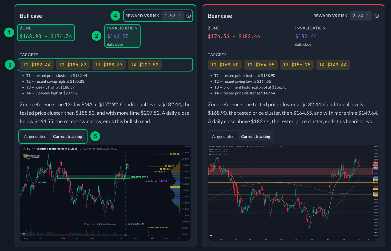
Here the bull case has the composed chart and the bear case has the plain levels-on-candles chart.
① Zone — the price area the case is built around. ② Invalidation — the closing level that ends the read. ③ Targets — T1 onward, in order. ④ Reward vs risk — the ratio to the first target. ⑤ Chart toggle — As generated or Current tracking.
Zone
The price area the case is built around. A range, not a single number, because a level is an area on a chart, not a line.
Breakout or breakdown level (optional)
A prior-tested congestion, range or swing boundary beyond the zone that could confirm continuation once price closes through it. It is a spot to watch, not an instruction to act. Moving averages, round numbers and options levels can reinforce the explanation, but do not create a confirmation level by themselves. If the supplied structure has no clean boundary, the row is simply omitted rather than invented. Older saved plans may call this the "trigger."
Invalidation
The most important number in the case. The price that, if the stock closes through it, means this read is done. Not "it dipped there intraday" — a daily close on shorter plans or a weekly close on longer plans.
Structure comes first. The boundary should have an explanation tied to the supplied chart evidence. ATR provides context for how tight that boundary is relative to recent movement. A verified boundary can remain closer than the preferred volatility buffer, with a warning about its tight distance; the planner does not need to invent or automatically widen a level to satisfy that buffer. Longer windows can share a boundary when the same structure is relevant.
A closing invalidation can sit exactly on a zone boundary: the condition is a close beyond it. At that exact reference price there is no positive distance to the threshold, so a reward:risk ratio is unavailable. This does not make losses impossible.
Read Why invalidation and any tight-boundary note together. The number ends the illustrated scenario under its stated daily or weekly closing rule. It is not a stop order, a maximum-loss guarantee, or a position-size calculation. Gaps and movement before the closing assessment can produce larger price changes.
Targets
Where the move could go if the case works, in order. T1, T2, T3.
The planner screens targets against structural evidence and a window-specific reach heuristic based on volatility and distance. This is a plausibility check, not a probability model: passing it does not make a target likely, and failing it does not mean a move is impossible. A complete case needs at least one supported target; when a complete two-sided map cannot be supported, the result can be No clean setup.
Longer windows can consider larger weekly and monthly shelves when the history supports them. Farther targets remain conditional on price progressing through the intervening structure. The number of targets depends on distinct evidence, not a requirement to fill every rung. A nearby T1 can be a useful checkpoint without representing a compelling trade from the current price.
A target is a level the move could reach, drawn from structure. Plenty of plans never reach their first one. Some go the other way first.
The chart
Under each case, the case drawn on the chart. Tap it to open it full-screen, then pinch to zoom in on the levels, drag to move around, and double-tap to snap back out. Same viewer the watchlist charts use, on a phone or a desktop.
The left side is real price history — candles, volume, and the moving average the plan reads (13-week on long windows, 13-day on short ones). The right side is deliberately left open, and that's where the plan lives:
- The zone is a shaded band.
- The targets step up (or down) as a ladder — T1, T2, T3 — each with its price.
- The invalidation is the purple dashed line, named and priced.
- The end of the plan's window is marked on the timeline with a small arrow, on a real future date.
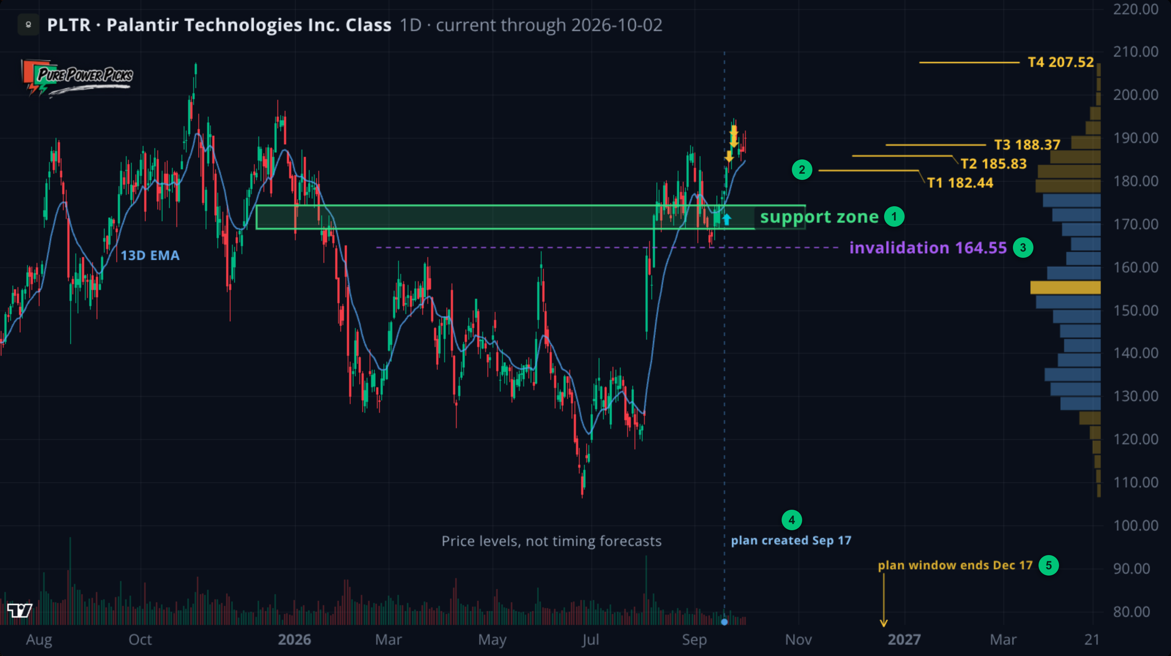
A Current tracking chart, opened full-screen.
① Zone — the shaded band. ② Targets — the ladder, T1 to T4, each with its price. ③ Invalidation — the purple dashed line. ④ Plan created — the divider that marks the day the plan was written. ⑤ End of the window — the small arrow on the timeline.
When the plan's own reasoning calls out a pattern the data can back up — a flag, an open gap, a 52-week level, a consolidation — the chart may sketch it. If any annotation would collide with a level, the chart drops the decoration and keeps the level, every time.
Each case gets its own chart, because both cases on one pane is unreadable. Every price on the chart is a number the plan already published in its text; nothing is invented, and a level the data can't support is left off rather than fudged.
As generated, or Current tracking. Once the tracker has cleared a session past the day a plan was written, a small toggle appears above the chart and the plan opens on Current tracking: the same levels held fixed, drawn on candles up to now, with a divider marking when the plan was created. Switch to As generated for the frozen original. A plan written moments ago has no newer chart to show, so there is no toggle and you are looking at the original.
Once in a while a case can't be drawn honestly — for example a saved plan after the stock has moved so far that its levels describe a different chart. When that happens you get a plain levels-on-candles chart instead of the composed one.
Reward vs risk
The corner of each case shows one number: the ratio to the first target. 2:1 means that target is twice as far away as the level that would break the read.
Tap or click it, or focus it and press Enter or Space, for the rest. The panel lists the ratio to the first target, the ratio to the final target when the ladder has more than one rung, and the range across the zone, then names the two prices the measurement runs between. When only one edge of the zone produces a figure, the row says which edge rather than showing a range. Escape dismisses it.
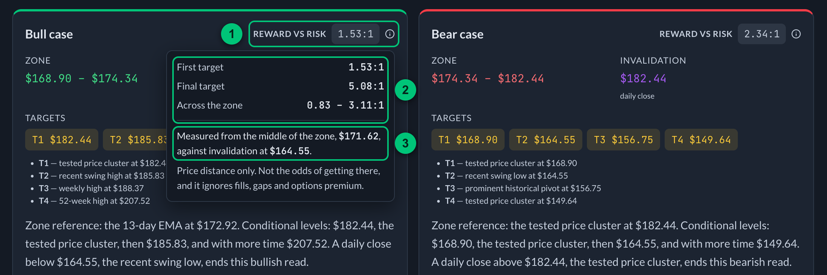
① Reward vs risk — tap or click it to open the panel. ② Ratios — to the first target, to the final target, and across the zone. ③ The two prices — the middle of the zone and the invalidation it is measured against.
Every figure is measured from the middle of the zone against invalidation. That midpoint is a reference price inside the zone, not a price you obtained, and it can differ a lot from the stock's price when the plan was written.
R:R measures underlying price distances, not probability, expected return, an actual fill or options-premium performance. It does not include size, gaps, slippage or losses before a closing invalidation.
Reference levels
Under the price rail: the verified support and resistance the plan drew from, each side on one line. These are the same levels the rail draws as grey ticks. A plan does not use every one of them; they are the pool its zones, targets and invalidations were chosen out of.
When something is off with the data
A plan that could not be built cleanly says so in a notice above the two cases, not in small print below them. That covers the cases worth knowing about: earnings inside the window, no tested structure near the current price, or a level the planner proposed that could not be verified.
A plan without that notice is not a promise that every input was complete or current.
Options positioning
Some plans show Options concentration context by expiry. It is calculated from an options-chain snapshot, with an assumed positive sign for calls and negative sign for puts.
- Call wall — a legacy name for the strongest positive modeled concentration.
- Put wall — a legacy name for the strongest negative modeled concentration.
- Strike balance — a cumulative signed-balance reference across strike buckets. Older plans may call it a “flip.” It is not a verified zero-gamma crossing obtained by repricing dealer inventory across stock prices. An unavailable value appears as —.
Open interest does not reveal actual dealer inventory or executed hedges. These modeled concentrations do not establish that a strike will cap, support or pin price, or that hedging caused past moves. They can add context near independently supported chart levels. Open interest, greeks and stock-price observations can have different timestamps; the snapshot does not establish a fixed delay or exact data vintage.
Contracts at these levels
Where available to paid members, this section lists option contracts near the plan's published levels: calls for the bull case and puts for the bear case. These are references for further research.
Two rules decide what's in the list:
- Expiry is after the original saved end date. Reopening a three-month plan does not restart three months from today. Closed or expired plans return no contract list. If the original window cannot be verified or no qualifying expiry is listed, the section explains that limitation.
- Strike is near a published level. Each row identifies its reference, such as the zone or a target. A nearby strike is not a recommended entry or a profitable options payoff at that stock price.
Rows can show delta, reported open interest and volume, and a liquidity label. Expiry is abbreviated to fit one line ("Oct 17", with the year added when it is not the current one) and the days left sit beside it; hover or tap the date for the full one. The label compares activity within the returned contract sample for this ticker, which is limited by the requested strike and expiry range. Its color and rank summarize those observations; they do not identify who owns the contracts or guarantee an executable market. If the provider's response is truncated or completion cannot be established, contract references are withheld.
Two places explain the words right on the page: the ⓘ grade guide above the tables walks the full range best to worst, and a legend under them defines each word that actually appears.
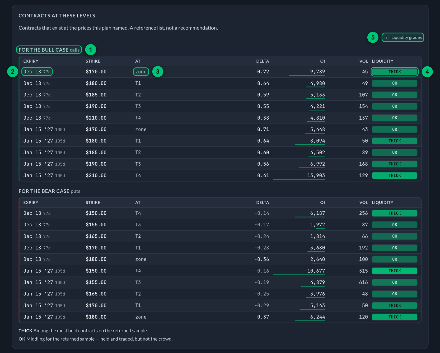
① Case — calls for the bull case, puts for the bear case. ② Expiry — the short date, with the days left beside it. ③ At — the plan level the strike sits near. ④ Liquidity — the label for that row. ⑤ Liquidity grades — the ⓘ guide to the full range.
On a narrow screen each contract folds onto two lines — expiry, strike and reference on top, delta, open interest and volume underneath, with the liquidity grade beside them — so nothing sits off the edge behind a sideways scroll.
| Word | Means |
|---|---|
| Thick | Among the most held contracts in the returned sample. |
| OK | Moderate reported activity relative to the returned sample. |
| Thin | Low reported activity relative to the returned sample. |
| Avoid | Very low reported activity under the grading rules. |
Liquidity is graded within the returned sample. When that sample is thin, “thick” can still mean thin compared with a more actively traded stock. Open interest and volume are only liquidity proxies.
Spread appears only for a usable two-sided quote with an observed timestamp no more than 20 minutes old when checked. Missing, invalid, future-dated or older quotes are not graded. This age policy does not establish a provider's delay or guarantee that a price is still executable. Check current bid, ask and trading conditions with your broker. An underlying target being reached does not guarantee an option profit: premium, time and volatility also matter.
Nothing here is ranked by how good it looks, nothing is marked as the one to take, and no row suggests a size. It's the chain, filtered to your plan. You choose.
Earnings and other events
The next earnings date is on the stat line at the top of every plan, with the days until it. It comes from a data provider and is not a confirmed company announcement — recheck it before you rely on it.
The planner does not print a calendar of other events. Use your own source for Federal Reserve decisions, CPI and jobs reports. What matters for a plan is that a scheduled event inside your window can gap price straight through a closing invalidation level, and that for options, changing implied volatility can move value even when the stock goes the way you expected.
Every plan still saves its original event snapshot when it is generated, so nothing is lost if this comes back on screen later.
Plan Replay, review and Insights
Once tracking has run, a saved plan gains Plan Replay. It reconstructs the original map from the recorded daily or weekly events, without rewriting the plan after the fact.
The replay shows:
- Time tracked — how much of the selected timeframe had elapsed when the plan was last checked.
- First target reached — how many days passed before the first target was reached.
- Furthest target — the furthest counted target reached by either side.
- Bull and bear paths — whether each case started, its credited targets, and whether invalidation was reached in tracked data.
- What happened, in order — the exact date, plan level, and observed price for each event.
The sequence matters. A target on the same recorded day that a case first starts is not credited when the bar cannot establish that the start came first. Ambiguous observations remain in the timeline as Not counted. Reprocessing the same prices must not improve the result.
A different situation has a known order: if the case was already active before a session, an intraday target can be reached before that session's closing invalidation. That target can count even though the case later ends. Touching a target after invalidation is not credited. A zone-only case may start at creation when the original price is in its zone; generation-day bars still do not earn target credit.
Switch a chart from As generated to Current tracking and a blue divider marks the exact day the plan was created. Price action before it is the setup; price action after it is what happened during the plan. Compact arrows mark later plan events when the current chart has the matching bars. The original plan levels stay fixed; only the candles and markers update.
Under the replay, Plan review turns those same recorded facts into a short learning recap. It shows whether each case activated, the furthest target that was credited, whether invalidation was reached, and the original structural evidence attached to that target. The explanation is assembled from the saved levels and ordered events; it does not invent a news explanation, a member action, or a result.
Paid member Insights combines eligible complete plans into four views. Generation-version counts distinguish current, older and unknown versions without removing older plans or claiming their historical tracking has been recreated:
- Plan journey — how many complete maps reached a zone, activated, then reached T1, T2, or T3 and beyond.
- Learning signals — explicit rates with their denominators, plus median time to activation and from activation to T1 when a sample exists.
- Outcome mix — which side resolved through the map, which maps needed a redraw, and which windows ended without activation or full resolution.
- Window comparison — the same measures split by 2-week, 1-month, 3-month, 6-month, and 12-month plans.
Every funnel step counts plans, not individual target events. For example, “T1 after activation” means plans that reached at least one first target divided by plans where at least one case completed its activation rule. The map count is always displayed so a small sample is visible.
These are observations of a two-sided map, not a trading win rate or a return calculation. They show how often the starting conditions appeared, how far price traveled through the levels, and when cases ended. Read the sample size, generation-version counts and tracked-through dates. Historical rules and data coverage can differ, so blended rates do not establish the current generator's quality. A target touch does not establish that the original plan was useful from every entry price.
Free members can reopen older saved plans and read basic tracking and review. This does not change the generation allowance shown in the app.
Adding your own numbers
You may see a place to record what you got in at. This is off by default while it's reviewed. When it's on, it does one thing: draw your number against the levels the plan already published — where you sit relative to the zone, which targets are behind you, how far invalidation is. It never changes the plan, and it never tells you what to do.