Filters, Views & Analytics
The home page is more than a table — it's a control panel. This page covers the three ways you shape what you see: filters, views, and the analytics up top.
Filters
Open the Filters panel (it can be collapsed to save space) to narrow the table down. A live counter shows how many alerts match.
| Filter | What it does |
|---|---|
| Search | Type a ticker (e.g. AAPL) to show only that symbol. |
| Alert Type | Show All, only Calls, or only Puts. |
| Status | Tick one or more statuses to show only those — e.g. only At Risk, or only Opportunity Zone. |
| Date From / Date To | Limit to alerts published within a date range. |
| Show Expired | Toggle whether expired contracts appear. Off by default. |
| View My Alerts | Show only the alerts you've starred. |
Hit Reset Filters to clear everything at once. Pagination controls let you show 10, 25, 50, 100, or 500 alerts per page.
Sorting
Click any column header to sort by it; click again to reverse. A small arrow (↑ / ↓) shows the active sort. Sort by Max Opp % to see the biggest runners, by Days Left to find what's expiring soon, or by Score to surface the highest‑conviction ideas.
Views
Use the view toggle to pick the layout that suits you:
- Modern view — the default styled table with hover effects.
- Classic view — a spreadsheet‑style grid that adds milestone columns (+10%, +20% … +100%) that fill in green as each alert's max opportunity crosses them. Great for scanning a lot of alerts fast.
- Cards — on phones, the table automatically becomes a stack of cards showing ticker, type, strike, expiration, alerted price, max opp, current, and status.
Your choice is remembered on each device.
Analytics
At the top of the page is a collapsible analytics panel summarizing all the alerts currently in view:
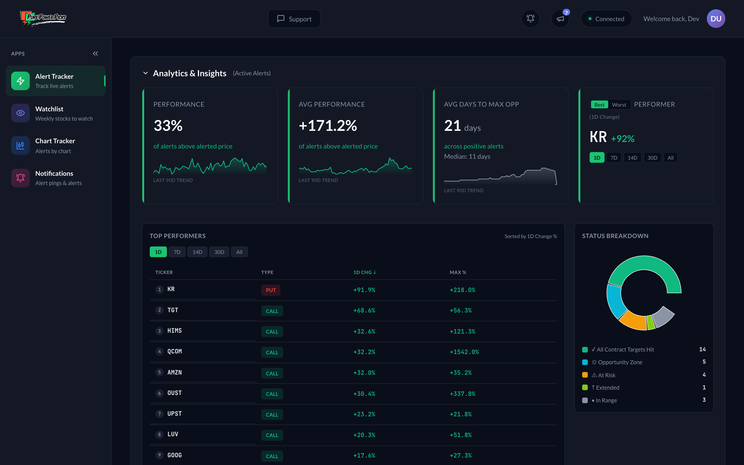
The analytics panel: performance and average-gain stats with 90‑day sparklines, the best performer with a time‑window toggle, a Top Performers list, and the Status Breakdown donut.
| Stat | What it means |
|---|---|
| Performance | The share of active alerts currently trading above their alerted price — a quick health read on the board. |
| Avg Performance | The average gain across alerts that are above their alerted price. |
| Avg Days to Max Opp | On average (and median), how many market days alerts take to reach their peak. |
| Best / Worst Performer | The top and bottom alert for the selected time window. |
| Time Period | Toggle the window for best/worst and period change: 1D, 7D, 14D, 30D, or All‑time. (1D = today's move; All = the whole move since the alert.) |
| Status Breakdown | A pie chart of how many alerts are in each status. Click a slice to filter the table to it. |
| Top Performers | A ranked list of the strongest alerts, sortable by Current %, Max Opp %, or period change. |
Small 90‑day sparklines on the headline stats show how the board's performance, average gain, and speed‑to‑peak have trended over time.
A common workflow: set Status → Opportunity Zone, sort by Score descending, and you've got a shortlist of the highest‑conviction ideas currently sitting near support. Then open each one's detail page to dig in.
The analytics describe the opportunity the alerts presented based on market prices — they are not a track record of trades or returns. See the disclaimer.