The Alerts Table
The home page of the tracker is one big, sortable table — every alert, one per row, with its live performance. This page explains every column so no number is a mystery.
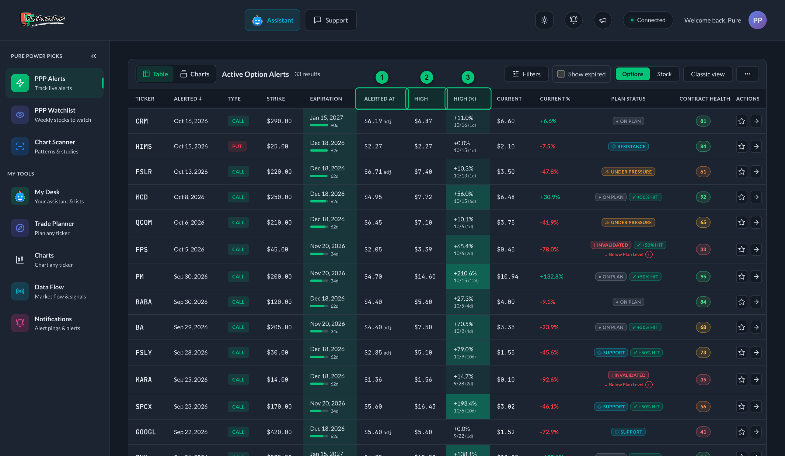
① Alerted At — the price the alert is tracked from. ② High — the highest recorded price of the contract after the alert. ③ High (%) — how far the High sits above Alerted At, with the date it was recorded and the market days it took.
Options is the default lens. It keeps contract performance, the High, current value, Plan State, historical results, and time to expiration together in one row.
Table or Charts
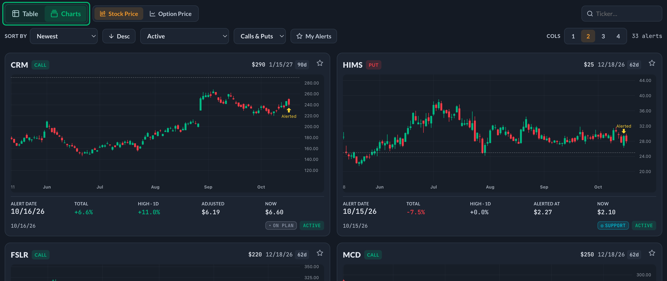
The Table | Charts switch at the top of PPP Alerts flips the whole board between this table and Alert Charts: every alert as its own live chart, with the moment it went out marked and its key numbers underneath. Use the table to compare numbers side by side, and Charts to see at a glance how each idea is actually moving. Switching back and forth keeps your place in each view.
Use Options | Stock to change the performance lens. When Options is selected, Modern view | Classic view changes the table layout. On phones, either lens becomes a stack of cards with fields matched to that lens. See Filters & Views.
Modern, Classic, and mobile all reuse the same Status spot: active plan state while the contract is live, then Final Review (or Expired) after it ends. Classic does not add a separate Final Review column.
Where the other buttons went. The ⋯ button at the right of the alerts header holds View My Alerts and Export CSV — plus the view switch on a phone. They used to sit on the header itself, which took up so much of a phone screen that barely one alert fitted underneath it.
Export CSV in the mobile app. In a browser the file downloads the usual way. In the iOS or Android app it opens your normal share sheet instead, so you can save the CSV to Files, send it to yourself, or drop it into any app that takes a file.
The old Columns picker is gone. Every column is shown, and Export CSV now includes them all on every device rather than following what was on screen. The CSV keeps Displayed Status, Plan State, Contract Result, Lifecycle, and Final Review as separate fields, followed by the Final Review evidence. A +50% achievement is never flattened into the stock plan, lifecycle, or path review.
Options column reference
Because Options is the default lens, its contract columns come first:
| Column | What it shows | What it means |
|---|---|---|
| Ticker | The stock symbol (e.g. AAPL) | The underlying company the option is on. |
| Alerted | A date (e.g. 2/16) | The day the alert was published to members. |
| Type | CALL or PUT | A call profits if the stock goes up; a put profits if it goes down. See the Glossary. |
| Strike | A price (e.g. $175.00) | The strike price of the contract — the price level the option is built around. |
| Expiration | A date plus a time bar (e.g. 3/21 and 7d) | The day the contract expires, and how much of its original timeframe is left. The bar shrinks as expiration approaches — green means plenty of time, amber getting close, red expiring soon. The cell is tinted too: green over 30 days out, amber 22–30 days, red 21 days or fewer. |
| Alerted At | A price (e.g. $3.50) | The contract's price at the moment of the alert. This is the baseline every performance number is measured from. May show a small adj tag — see Entry states below. |
| High | A price (e.g. $6.50) | The contract's highest recorded price since the alert, measured from real trades so one‑off outlier prints don't count. Shows — until a High is recorded. See High. (Formerly Max Opp.) |
| High (%) | A percentage plus a date (e.g. +85.7% over 2/23 (5d)) | The change to High: how far the contract ran from the alerted price to its High. (Formerly Max Opp %.) Underneath it, the date the High was recorded and which market day of the alert's life it was (the alert day counts as day 1, so a same‑day High shows 1d). Dates from a previous year carry the year: 12/2/25. The cell shades deeper green the bigger the percentage — see Reading the colors below. Hover the cell for the full date. |
| Current | A price (e.g. $4.20) or — | What the contract is worth right now. Shows — once the contract has expired. |
| Current % | A percentage (e.g. +20.0%) | Where the contract stands right now versus the alerted price. |
| Status | A primary badge plus limited context | While active, Plan State leads; +50% Contract Delivered and Near Expiration may appear separately. After expiration, an evidence-backed Final Review leads, with Expired and +50% retained as context; otherwise Expired is the fallback. Full explanation in Alert Statuses & Final Review. |
| Actions | ⭐ and ➔ | Star adds the alert to My Alerts; the arrow opens the full detail page. |
Reading the colors
Two columns are shaded so you can find what matters without reading every row.
High (%) gets greener the bigger it is:
| High (%) | Shade |
|---|---|
| Under +10% | No color |
| +10% to +24% | Faintest green |
| +25% to +49% | Light green |
| +50% to +99% | Green |
| +100% to +149% | Deeper green |
| +150% to +299% | Deeper still |
| +300% and up | Deepest green |
Expiration is shaded by how much time is left:
| Time left | Shade |
|---|---|
| More than 30 days | Green |
| 22 to 30 days | Amber |
| 21 days or fewer | Red |
| Already expired | Grey |
Amber is a narrow warning band on purpose. It means the Near Expiration badge is about to appear, not that an alert is old — a freshly published 45‑day contract is green on day one.
These cutoffs are fixed, not ranked against the other rows. A +300% alert is the deepest green whether it is the only alert on screen or one of two hundred, so a color always means the same thing. Filtering the table never changes them.
Stock view shades the same way, on its own scale. Best Move and the move under Now get greener the further the stock has run in the plan's favour — but because stock moves are smaller than option moves, the bands are smaller too:
| Favourable stock move | Shade |
|---|---|
| Under +1% | No color |
| +1% to +2.4% | Faintest green |
| +2.5% to +4.9% | Light green |
| +5% to +7.9% | Green |
| +8% to +11.9% | Deeper green |
| +12% to +17.9% | Deeper still |
| +18% and up | Deepest green |
Only favourable moves shade. A move against the plan keeps its red number and no color, so green always means the stock is going the right way.
High vs. Current — the key distinction
Two columns trip people up at first, so it's worth being clear:
- High (%) is the best the contract did after the alert — its High. It already happened and never goes down.
- Current % is where the contract is right now — it moves up and down all day.
A contract can show a change to High of +85% while Current sits at +20%. That's normal: it means the contract ran to +85% at its High, then pulled back to +20%. Neither number is "wrong" — they answer different questions ("how far did it go?" vs. "where is it now?"). See High for the full breakdown.
Entry states: pending & adj
Before performance can be tracked, the alerted price has to actually be reachable in the market. An alert can be in one of three entry states:
| State | What you see | What it means |
|---|---|---|
| Pending | "Awaiting bid" in place of the % numbers | The alerted price hasn't traded yet, so tracking hasn't started. The performance columns stay blank until it does. |
| Adjusted | An adj tag on the Alerted At price | The originally alerted price never filled, so tracking was moved to the closest price that actually traded. The numbers are honest — they measure from a price you could really have gotten. |
| Normal | A plain price, no tag | The alerted price traded and tracking started immediately. |
This keeps the tracker honest. If a contract's quoted price never actually traded, counting a move from it would inflate the results. Pending/adjusted states make sure every percentage is measured from a price the market really offered.
Reading a row at a glance
A typical row reads like a sentence:
NVDA · CALL · $130 strike · exp 3/21 — alerted at $4.10, ran to $7.95 (+93.9%) on 2/27 (4d), now $6.20 (+51.2%), Plan · On Plan, +50% Contract Delivered, 9d left.
Translation: a bullish NVDA call alerted at $4.10 peaked at +93.9% on its fourth market day, is currently up about 51%, the stock plan remains on the valid side of its published level, the +50% contract achievement is recorded, and nine days remain.
On a phone
The same alert becomes a card. The ticker, direction and ⭐ sit on the top line; strike and expiration sit under it; then a compact strip of Alerted, change, Current, and To High (the change to High). The shared Status footer leads with Plan State while active and Final Review after expiration; lifecycle and any +50% achievement remain separate context. Tap a Final Review to see its evidence.
The date the alert went out sits directly under the Alerted price, so you can tell a fresh idea from an older one without opening it. It shows as Aug 1 for alerts from this year and Aug 1, 25 for older ones. On an adjusted alert the strip says Tracked instead of Alerted, but the date is still the day the alert was published — that never changes.
Options view vs. Stock view
Once the Options lens is clear, the Stock lens lets you evaluate the underlying plan separately from its contract. Every alert starts with a direction, an underlying price, an invalidation level, and targets; the Options | Stock toggle lets you read that same alert through either lens:
- Options (the default) — strike, expiration and time left, contract price, contract opportunity, and the shared Status surface.
- Stock — the underlying move from its own Alerted At baseline, the best favorable stock move, progress through published targets, distance to invalidation, and the same shared Status surface.
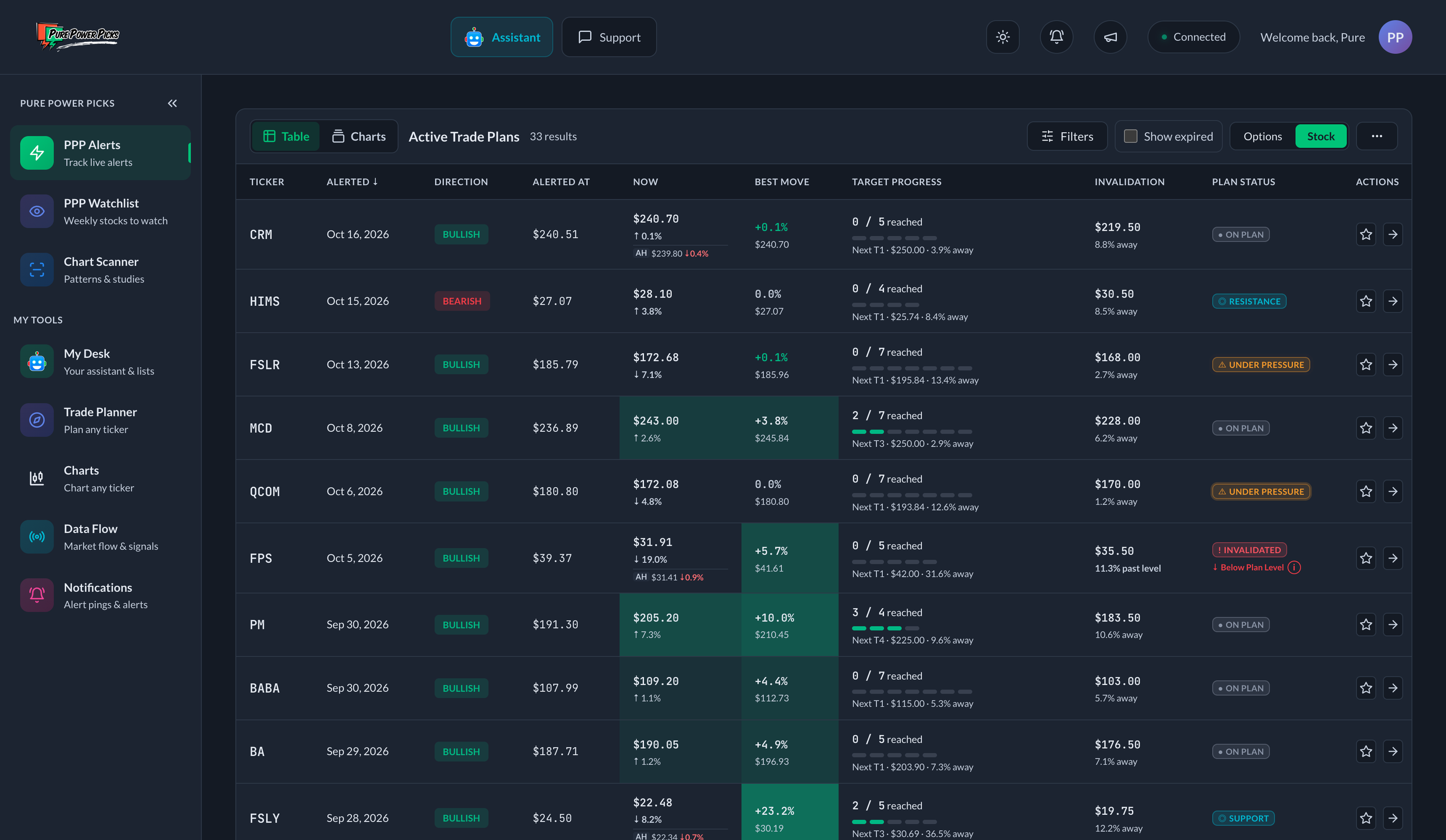
Stock view keeps the underlying idea separate from the option contract and puts its performance, published levels, and plan health in one row.
| Column | What it shows | What it means |
|---|---|---|
| Alerted At | A price (e.g. $142.50) | The best available tracked stock baseline for the alert. The tracker uses the first available minute bar at or after the alert when possible; if that snapshot is unavailable, it may use the session close as a fallback. |
| Now | The current price and its move from Alerted At (e.g. $136.50 ↓4.2%) | The arrow and percentage report the stock's actual direction. Color shows whether that move favors the idea: a drop is green for a bearish idea and red for a bullish one. |
| Best Move | The best favorable stock move since the alert | The largest underlying-stock opportunity that showed up after the alert, measured from Alerted At. For bullish ideas it uses the best post-alert high; for bearish ideas it uses the best post-alert low. It records opportunity, not a member's realized result. |
| Target Progress | Targets reached and the next published target | The compact summary shows how many plan targets have been reached and how far away the next target is. On desktop, hover over the cell to see the full ladder with reached levels checked off; on mobile, open the alert for the complete level detail. |
| Invalidation | The published level and its distance from the current price | A direct distance read showing how much room remains or how far price has moved past the exact level. An intraday cross puts the plan Under Pressure; a daily close beyond it confirms Invalidated. |
| Status | The alert's Plan State or Final Review | The same active Plan State shown in Options view. After expiration, Final Review leads when complete evidence exists; otherwise Expired is the fallback. Switching lenses does not recalculate or reinterpret it. See Alert Statuses & Final Review. |
| Actions | ⭐ and ➔ | Star adds the alert to My Alerts; the arrow opens the full detail page. |
After-hours and pre-market
When the market is closed, Now can carry a second, smaller line beneath the price:
  9.04
↓ 4.3%
AH 7.83  ↓13.4%
The top figure is still the regular session — the official close, exactly as before. The AH line is what the stock has done since the bell, in after-hours trading. Before the opening bell it reads Pre instead and measures against the previous session's close.
A few things worth knowing about it:
- It only appears when something happened. Moves smaller than 0.25% are not shown, so most evenings the column looks exactly as it always has.
- It never changes a status. Overnight trading is thin and often reverses by morning, so an after-hours move does not move an alert's status, does not count toward the High, and does not trigger any notification. It is information, not a trigger.
- The color follows the stock, not the plan. Unlike the move on the line above it, this one is green when the stock rose and red when it fell, whichever direction the idea wanted.
- It disappears when the session opens, because the main price is live again.
The alert detail page shows the same thing under the stock's Now figure, spelled out as "After hours" or "Pre-market".
Best Move and Now answer different questions. Best Move shows the best favorable move that appeared at any point after the alert and does not shrink after a pullback. Now shows the stock's live price and move at this moment. Likewise, reached targets stay checked in Target Progress even if the stock later moves back through them.
The tracker handles the alert day conservatively: the current post-alert quote counts, but it does not credit the session's stored daily high or low because that extreme may have happened before the alert was published. Recorded daily extremes begin with the next market session rather than risk overstating the opportunity.
There is no time-left bar in the Stock view — that countdown belongs to the option contract. If a stock baseline has not populated yet, the row says Baseline pending instead of presenting incomplete stock-performance numbers.
The default table shows alerts only while the attached contract is active. If you turn on Show Expired, the Stock view preserves the stock-performance history recorded through that lifecycle. Now is the last tracked stock snapshot rather than post-expiration live monitoring, and Status becomes Final Review after expiration when complete evidence exists; otherwise it says Expired.
On phones, choosing Stock changes the alert cards too. Each card keeps the same stock-focused story — Alerted At, Now, Best Move, Target Progress, Invalidation distance, and the shared Status surface.
Export CSV follows the selected lens as well. In Options view, Alerted At exports the same price the table shows (the adjusted price on an adj alert, which is what Change to High is measured from), and Alerted Bid keeps the original alerted bid beside it. In either lens it keeps Displayed Status, Plan State, Contract Result, Lifecycle, and Final Review distinct, followed by evidence columns for the change to High, deepest close through the High's session, tracking basis, and High date. Stock view also includes the underlying move, Best Move, target progress, invalidation distance, and whether stock tracking is active or ended rather than the option-contract performance columns.
The Stock view describes the price opportunity that appeared after an alert. It does not assume that a member acted at the alerted price, captured a target, or realized the maximum move. Not every idea reaches a target, and some draw down before moving favorably.
The toggle exists because a table row has limited width. Open any alert's detail page and you get both lenses at once — an Option Contract band beside a Stock Performance band carrying these same stock numbers. The frozen Plan State remains available with the plan evidence; the header Status follows the same active-versus-expired rule as the table.
Next
- Alert Statuses & Final Review → — what each status lane records.
- High → — the headline number, in depth.
- Filters & Views → — narrow the table down and switch views.