Charts
Charts is a full chart workspace built into the tracker. Pick any stock, pick a timeframe from 1 minute to monthly, add studies, draw your levels, and save the whole setup as a layout. Everything you draw and save is private to your account and follows you across devices.
Find it in the sidebar (bottom nav on your phone) as Charts. Everything works on a phone too, drawing included.
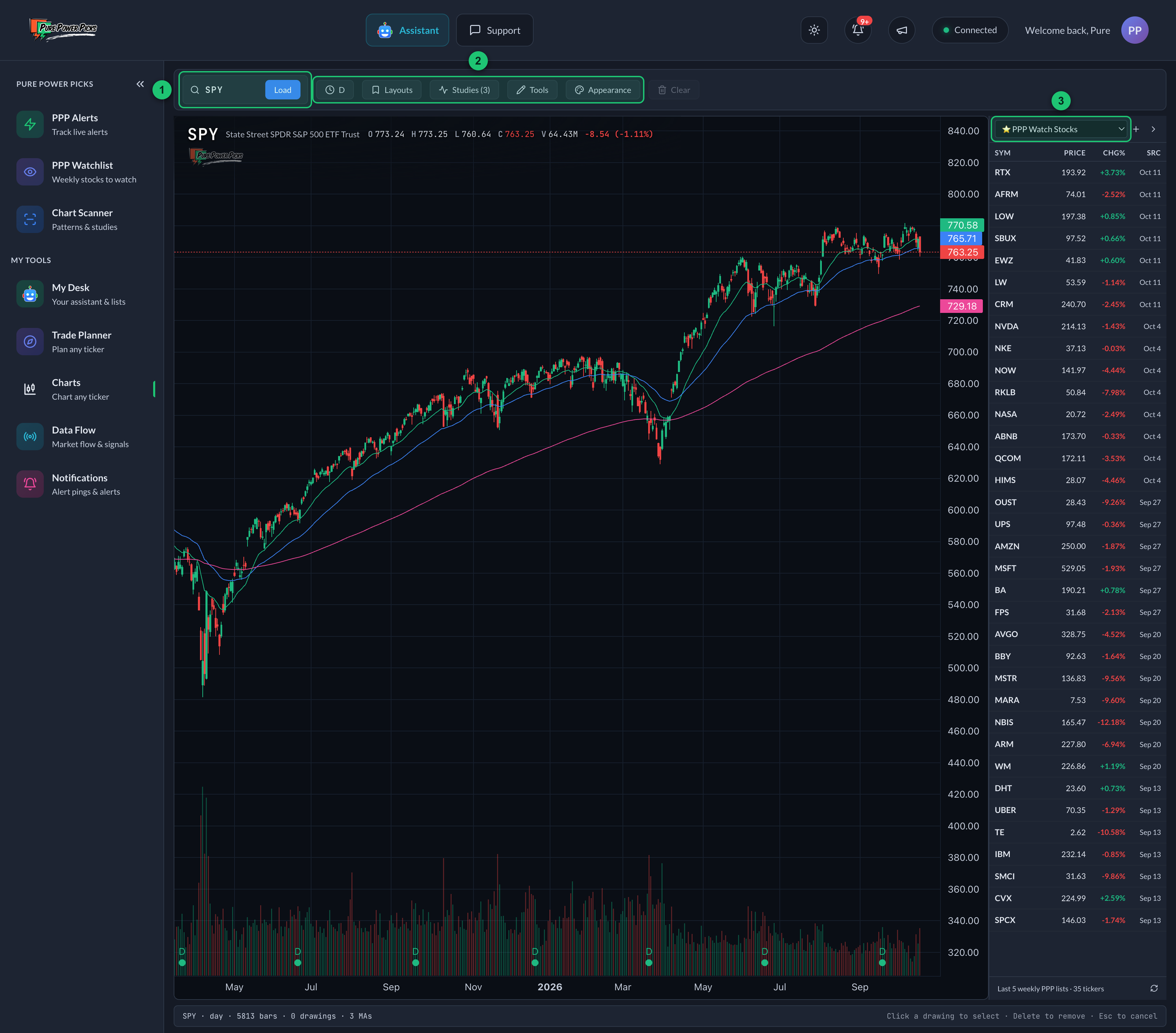
The Charts page on a daily chart.
① Ticker box — type a ticker or a company name. ② Chart buttons — the timeframe (clock), Layouts, Studies, Tools and Appearance. ③ Watchlist panel — pick a list, then click a row to load that stock's chart.
Alert Charts (PPP Alerts → Charts) show every PPP alert as its own small chart — a visual scan of the board. Charts is one big chart of any stock you choose, with the full toolkit. Scan the board in one, study a single name in the other.
Loading a stock
Click the ticker box (on your phone, tap the ticker chip) and start typing — a ticker or a company name both work. Pick from the results, or press Enter to load the symbol directly. On desktop you can just start typing anywhere on the page, TradingView-style, and the search opens itself.
You can also link straight to a chart: /charts?ticker=NVDA&tf=1h opens NVDA on the hourly.
Charts remembers where you were. Leave the page and come back and it reopens on the same stock and the same timeframe, with your drawings on it. A link like the one above still wins — it opens exactly what it points at.
Your settings follow your account. Appearance, volume, the volume profile, RSI and MACD, your moving-average set, VWAP, and your last timeframe all sync — set up the chart the way you like it on your desktop and your phone opens it the same way. The pop-up chart also opens on the timeframe you last used, instead of resetting to Daily every time.
Timeframes
From 1m up to M (monthly). On desktop they're in the clock dropdown; on your phone they're a row of one-tap pills right above the chart. Turn your phone sideways and the pills move into the clock button instead — tap it and pick from the menu.
Pick your default view. At the bottom of the clock dropdown, one button sets the timeframe you're on as the view new charts open with — the pop-up chart and the chart on every alert page. On your phone, tap the timeframe you're already on and the same button appears under the row. A dot marks your default in the picker, and the choice follows your account. (This page itself still reopens wherever you left it, and an alert page with no default chosen opens on the weekly plan view.)
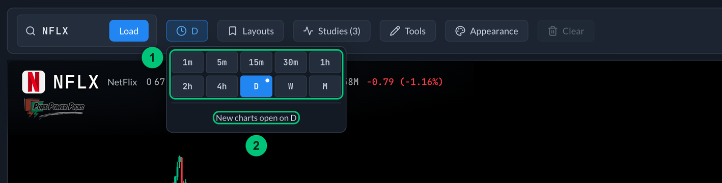
① Timeframes — 1m up to M; the one in use is filled in, and the dot marks your default. ② Default view — the timeframe new charts open with.
Rotate your phone and the Charts page goes full screen: the app's menus step out of the way, the chart buttons stack in a slim rail on the left, and the chart gets the whole height. Rotate back upright to bring the menus back.
How fresh is the price?
The pill next to the ticker tells you honestly:
- Live — updating as trades print.
- Delayed 15m — what's on screen is about 15 minutes behind the market.
- Not live — streaming isn't available right now; the chart is still current to its last refresh, and changing symbol or timeframe refreshes it again.
Daily, weekly and monthly charts don't stream — they update when you load them.
Studies
The Studies panel (pulse icon) has:
- Moving averages — EMAs (solid) and SMAs (dashed) from 7 to 200, each with its own color and an optional label on the price axis.
- Session VWAP — the volume-weighted average price for the trading day. Intraday timeframes only, where it means something.
- Volume Profile — a sideways histogram showing where the volume traded across the visible range, so you can see the prices the market actually cared about.
- RSI (14) — the relative strength index in its own panel below the price chart, with the 70 and 30 lines marked. Standard 14-period settings, so it matches what you see on TradingView or your broker.
- MACD (12, 26, 9) — the MACD line, its signal line, and the histogram in a second panel. Same standard settings, same reason.
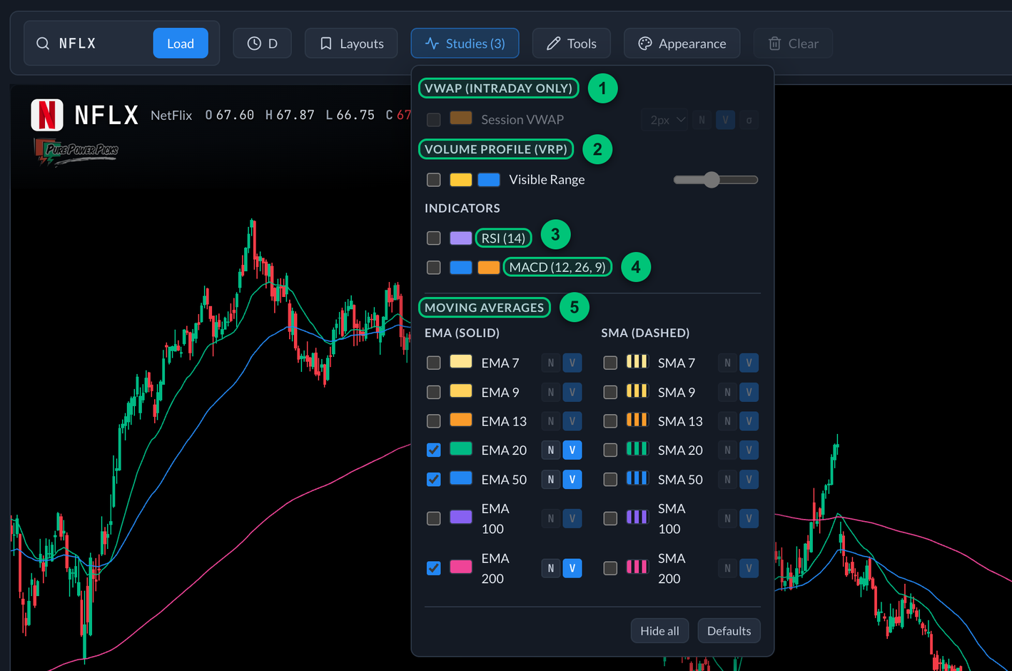
The Studies panel on a daily chart, so Session VWAP is greyed out.
① Session VWAP — intraday timeframes only. ② Volume Profile — where the volume traded across the visible range. ③ RSI (14) — opens in its own panel below the price chart. ④ MACD (12, 26, 9) — opens in a second panel. ⑤ Moving averages — EMAs and SMAs from 7 to 200.
Drawing your levels
The Tools menu (pencil icon) has trend lines, rays, horizontal and vertical lines, channels, rectangles and other shapes, Fibonacci retracements, and text notes.
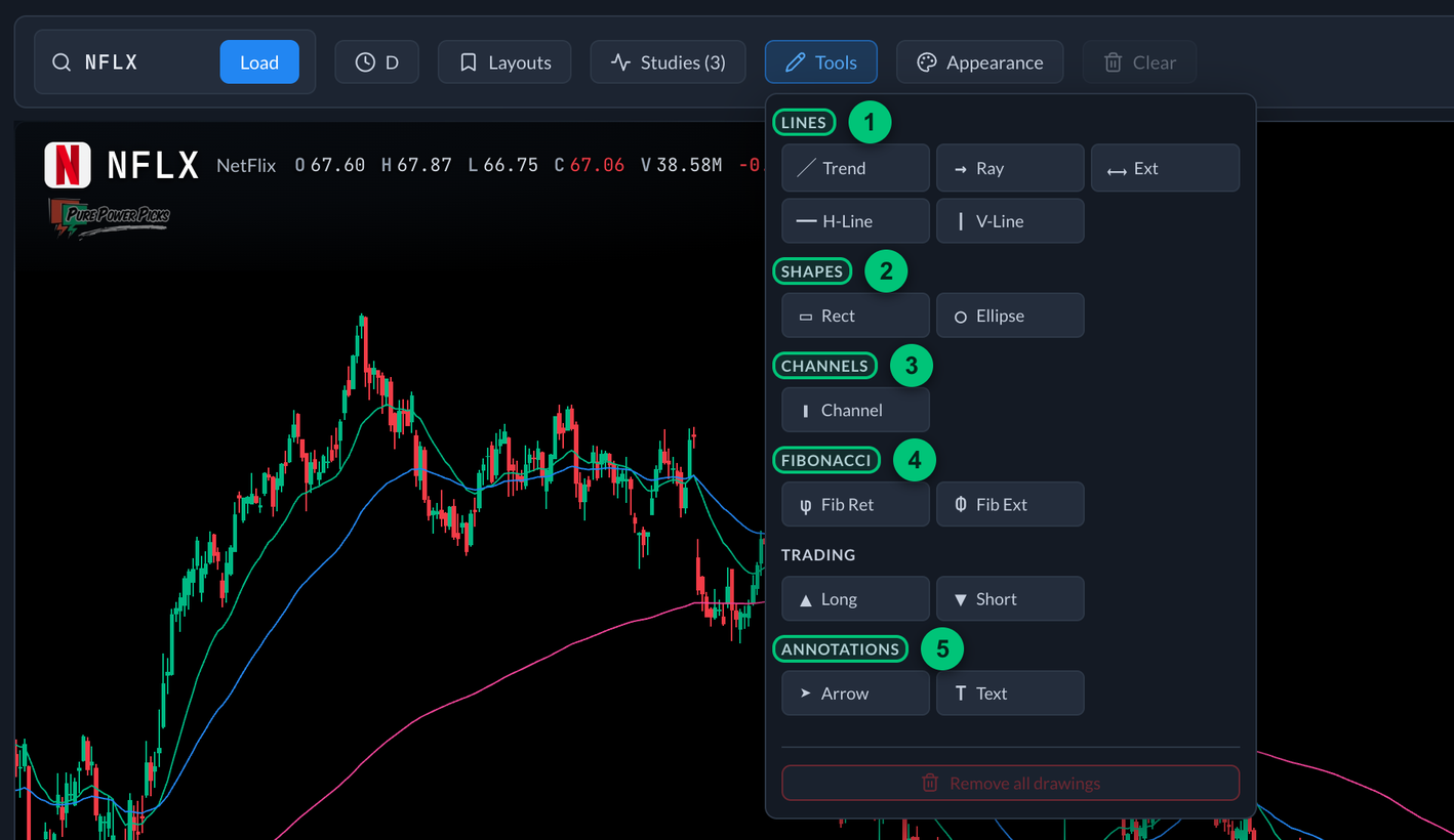
① Lines — trend lines, rays, horizontal and vertical lines. ② Shapes — rectangles and ellipses. ③ Channels — a three-point tool. ④ Fibonacci — retracements and extensions. ⑤ Annotations — arrows and text notes.
To draw: pick a tool, then drag across the chart — the shape follows as you go and finishes when you let go. Prefer tapping? Tap once for each point instead; the bar at the bottom tells you how many are left. Tools that need three points (channels, Fib extensions) take a drag and then one more point.
To change one: tap it to select. Then drag a corner handle to reshape it, or drag its middle to move the whole thing. The bar that appears lets you recolor it, change its thickness, or delete it. Horizontal lines can be set to an exact price.
You can draw in the empty space to the right of the last candle too, so a level or a note can sit out ahead of price rather than being squeezed onto the last bar.
Drawings save per ticker and sync to your account — draw a level on the NVDA daily and it's there when you drop to the 5-minute, holding the same spot in time, and there again when you open NVDA on another device.
The one exception is the chart on an alert's detail page. That one is the same tool, but its drawings are kept per alert — marking up one NVDA alert doesn't put lines on every other NVDA alert, or here.
While a drawing tool is picked, the chart gets an amber outline and stops panning, so your drag draws instead of scrolling the chart. Tap Cancel in the bar at the bottom to put it back.
Your watchlists, built in
The watchlist panel (right side on desktop, the list button on your phone) carries:
- ⭐ PPP Watch Stocks — the rolling last few weeks of the PPP Watchlist.
- ⚡ Active Alerts — the tickers behind PPP's currently active alerts, newest first.
- Your own lists — the same lists as My Watchlist. Add or remove a stock here and it changes on My Desk too.
Click any row to load that stock's chart. Live prices and day change update in the panel while you watch.
Layouts
Got the chart set up the way you like — timeframe, studies, colors? Layouts (bookmark icon) saves the whole arrangement under a name — the timeframe, moving averages, RSI/MACD, VWAP, and appearance — and it syncs to your account. Save as many as you want and switch between them; an asterisk means you've changed something since the last save.
The Default chart row at the top takes the layout off: it deselects whatever layout is loaded and puts the studies and appearance back to the chart's factory setup. Your timeframe stays where it is.
Appearance
The palette icon controls the look: background, grid brightness, candle colors, volume bars, price-axis label size, and the earnings, split and dividend markers on the chart itself. Those markers cover history as well as what's ahead — an E under the bar for every quarter the company reported inside the range you're looking at (report dates come straight from the company's SEC filings, going back years), a D on each ex-dividend date, and the next scheduled report out to the right. Two on the same bar merge into one badge, so DE is a dividend and an earnings report landing together.
Hover a badge (tap it on your phone) for the details: the exact date, the quarter, and the reported EPS against what was expected — or just the estimate for a report that hasn't happened yet.
Charts, studies and drawings are for studying price action and learning how setups behave. Nothing here is a recommendation to buy or sell anything.